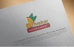
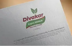
Logo Design for Retail Grocery / Supermarket Business Divakar Super Market

Overview
Overview
Divakar Super Market is a retail grocery brand positioned as a reliable, community-focused supermarket offering everyday essentials, fresh produce, and household products. The goal of the branding project was to create a strong, recognizable identity that reflects trust, affordability, and convenience while appealing to a wide customer base.
The logo needed to communicate three key elements:
- Reliability and trust
- Everyday accessibility
- Modern retail professionalism
Brand Challenge
In the highly competitive supermarket and grocery sector, brand visibility plays a critical role in attracting walk-in customers and building long-term loyalty. Many local supermarkets rely on generic branding, making it difficult to stand out in crowded markets.
Divakar Super Market required a logo that:
- Instantly communicates the nature of the business
- Feels bold and trustworthy
- Is easy to read from storefront signage
- Works well on packaging, bills, carry bags, and advertisements
- Appeals to families and daily shoppers
The identity had to be simple, impactful, and scalable across offline and online platforms.

Design Strategy
The design direction focused on bold typography and strong color contrast to ensure maximum visibility and brand recall.
1. Typography
The logo uses strong, uppercase lettering:
- “DIVAKAR” in blue
- “SUPER MARKET” in bold red
The heavy, sans-serif typography conveys stability, reliability, and strength — important traits for a retail brand. The stacked layout improves readability and allows the brand name to be instantly identifiable even from a distance.
2. Color Psychology
The color combination was carefully chosen:
- Blue represents trust, dependability, and professionalism.
- Red symbolizes energy, urgency, and retail excitement.
Red is commonly associated with sales, offers, and shopping environments, making it ideal for a supermarket brand. Blue balances the energy of red, ensuring the brand feels trustworthy rather than aggressive.
This color pairing creates a perfect mix of confidence and approachability.
3. Framed “Market” Element
The rounded rectangular outline around “MARKET” adds structure and emphasis. It visually anchors the design and creates a badge-like feel, reinforcing the identity of a dependable retail establishment.
The rounded corners soften the bold typography, making the brand appear friendly and welcoming.

Brand Positioning Impact
The logo positions Divakar Super Market as:
- A modern yet community-oriented store
- A dependable local retail brand
- A family-friendly supermarket
- A place for daily essentials and value shopping
The boldness of the design ensures high visibility on storefront boards, shopping bags, uniforms, and promotional banners.
Market Advantage
In the supermarket industry, clarity and familiarity are crucial. The logo achieves:
- Instant recognition
- Easy recall
- Strong shelf visibility
- Trust reinforcement
Unlike overly decorative or complex logos, this identity prioritizes functionality — essential for retail success.

Practical Applications
The logo is highly adaptable across multiple branding touchpoints:
- Storefront signage
- Grocery carry bags
- Packaging labels
- Billing invoices
- Promotional flyers
- Social media graphics
- Delivery vehicles
The simplicity of the design ensures cost-effective printing while maintaining visual strength.
The embossed presentation (as shown in the mockup) demonstrates how the logo maintains clarity even in textured or premium print formats.

Conclusion
The Divakar Super Market logo successfully captures the essence of a dependable neighborhood supermarket. Through bold typography, strategic color selection, and structured composition, the brand establishes itself as trustworthy, energetic, and accessible.
The identity is clean, scalable, and versatile — ensuring long-term usability across physical and digital platforms.
By combining retail psychology with modern design principles, this logo creates a solid foundation for Divakar Super Market to grow into a recognizable and respected name in the grocery retail sector.